
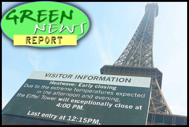
This video, which visualizes deviations from global average surface temperatures going back to when we started keeping records of it in the late 1800s, comes from those “conspiracy theorists” at NASA. Please watch it. It’s only 27 seconds long.
Then remind me again how, as fossil-fuel industry tool Sen. James Inhofe (R-OK) likes to say lie, “global warming is a hoax!”…
CLARIFICATION: For those, such as commenter Scott Billingsley below, who may have misunderstood the video above, or failed to read the information link on the video itself describing what the visualized data actually is, allow me to clarify…
The colors seen in the video represent the deviations from “the average global temperature from the mid-20th century,” as NASA explains. In other words, the deep red seen in the arctic at the top of the map at the end of the video represents how much warmer than the mid-century average temperature it is there now. It is not meant to represent, as Billingsley snarks below (adding “All I ever ask for is the truth”), that “According to the video, it is far hotter now where the glaciers are than the equator or places like the Sahara desert.”
I had thought all of that would be obvious, even to the most knee-jerk of denialists — who, apparently, should never be misunderestimated — but apparently not. So, I’ve slightly modified my description at the top of this article in hopes of making that clearer.


Can I take a stab at it?!!
The color changing is simply a manifestation of the natural variability of the number of crayons in the box they used to color the globe over time.
How’m I doin’?!!
David –
Good job! I can’t believe you haven’t been hired by Exxon or Inhofe yet!
Climate Change? What name so? Those colors? No those are pool party indicators. Everyone is having pool parties now.
Well, you know, NASA *cough cough cough* wants to spend our hard-earned taxpayer money on totally frivolous and expensive nonsense such as space exploration and the like. Why would you believe anything they say?!
I have found that people who deny there is any global warming come up without any answers as to what to do about the mercury that is now present in many of the high level predator fish like tuna that there are mercury warnings on tags next to the fresh fish in the meat counter. There is one really big source of atmospheric mercury (which falls out of the atmospher in rain and ends up in rivers and the oceans — and that is the burning of coal. So, if we can stop burning coal, maybe we will eventually be able to eat more than one serving of tuna per week without being poisoned by mecury in the fish. Try that one on the folks who say humans have nothing to do with climate change. Just begin by asking them if they have noticed the warning signs in the meat and fish markets regarding mercury in the fish.
However, my tomatoes are doing really, really well this year in the Pac NW. I guess you have to give a little to get a little. I figure in about 10 years I won’t have to put them in the pan, they’ll just cook on the vine. Now that’s what I call progress!
Interesting. According to the video, it is far hotter now where the glaciers are than the equator or places like the Sahara desert.
All I ever ask for is the truth.
This time lapse created video is too easy to pick apart.
Maybe next time.
Scott,
I never saw a key to tell exactly how to interpret that video but you’re interpretation seems most unlikely to me, Mr.”Truth Asker”.
My guess is that the changing colors represent increases in temperature in the specific places. Nothing to do with saying where glaciers are is now hotter than the Sahara.
What are you talking about?
That sort of denialism is too easy to pick apart.
Maybe next time.
It’s okay to disagree with a opposing view, but your credibility is hurt when you call that person a liar. Whether you agree or not, there is no consensus on the issue; the causes of climate change have not yet been determined. Those that insist that further discussion and research are not necessary are as flawed in their thinking as the were the leaders of the inquisition.
Scott Billingsley @ 7:
So, you are actually suggesting that you caught those rapscallion enviro-socialist hoaxsters at NASA trying to scam the world by falsely representing that it is “far hotter…where the glaciers are than the equator or places like the Sahara desert”?
That’s really what you think you’ve caught them doing? You are that much of a zombie denier?
Okay. I have added a clarification to the original article for folks like you, since I actually think you believe the response you offered above.
Sigh…Must be comforting to stay that willfully ignorant…or something.
Brad Fregger said @ 9:
And, whether you are aware of it or not, there is.
Um…those who offer pretend arguments out of whole cloth are as flawed in their thinking as are those who deny the decades long vast consensus of thousands of scientists around the world across dozens of earth science disciplines.
But I’m sure there must be somebody out there who “insist[s] that further discussion and research are not necessary”, because you said so, after all!
It is hard to get anyone in a cult to change their mind. Everyone I know that deny climate change watch Fox news.
This video effectively demonstrates the warming that has occurred in the 131 years described. Although not stated in the blog as a reason, the video does not prove that humans have anything to do with the observed warming. The video show the earth has warmed but by using the mid-century average ( a cool down) it exaggerates the late century warming; however there was still warming. The theory behind human caused (CO2) warming requires a warming area in the tropics which is not visible. While CO2 has been demonstrated conclusively to be greenhouse gas the affects in a non-labratory environment are not known. Because second order affects or feedback loops may result in CO2 increasing OR decreasing the temperature. I believe the greater impact on the climate by humans has more to do with deforestation and the Urban Heat Islands (asphalt, concrete, other human modifications to environment) that CO2 does.
As for consensus, it should be clear by the statements above that I’m part of the 97% consensus because I do believe the earth has warmed and I do believe that humans can affect the climate. Most people that are labeled deniers or sceptics share a similar view which is why the ‘consensus’ percentage is so high. Now if the consensus view was (which it is not) that humans are the only entities to blame for changing climate then the percentage would crumble. Having a consensus means absolutely nothing, nor does it prove anything. By the way the consensus view, based on perceived proof, was that the Earth was flat. As we know that consensus view was wrong.
The consensus view you are referring to was the public’s view. People of science at the time had a consensus that the earth was round and some of them had even calculated the diameter of the earth rather accurately. (Look up Eratosthenes calculated the diameter around 200BC, also got the tilt and distance from the sun.) Deniers are the plurality until they can’t deny it any more. It took the Europeans a very long time to accept that the sun was the center of our local system, it took them a long time to believe that the earth was round, many still don’t believe in evolution even though it obviously happens every flu season. It will be a while before deniers will accept that their worldview is wrong.
Here is an interesting history of public perception of climate change — what the scientists said and what the media reported:
http://www.aip.org/history/clim...pdf/Public.pdf
Brad, “derivation” (1st & 4th par.) should be “deviation” from mid-1900s average temps.
Those temperature differences are also called anomalies.
Brad, “derivation” (1st & 4th par.) should be “deviation” from mid-1900s average temps.
Those temperature differences are also called anomalies.
Rick H –
Duh. Thank you! Fixed!
Dr. Phil Jones ““ CRU emails ““ 5th July, 2005
“The scientific community would come down on me in no uncertain terms if I said the world had cooled from 1998. OK it has but it is only 7 years of data and it isn’t statistically significant”¦.”
Dr. Phil Jones ““ CRU emails ““ 7th May, 2009
‘Bottom line: the ‘no upward trend’ has to continue for a total of 15 years before we get worried.’
__________________
Dr. Judith L. Lean ““ Geophysical Research Letters ““ 15 Aug 2009
“”¦This lack of overall warming is analogous to the period from 2002 to 2008 when decreasing solar irradiance also countered much of the anthropogenic warming”¦”
__________________
Dr. Kevin Trenberth ““ CRU emails ““ 12 Oct. 2009
“Well, I have my own article on where the heck is global warming”¦..The fact is that we can’t account for the lack of warming at the moment and it is a travesty that we can’t.”
__________________
Dr. Mojib Latif ““ Spiegel ““ 19th November 2009
“At present, however, the warming is taking a break,””¦”¦.”There can be no argument about that,”
__________________
Dr. Jochem Marotzke ““ Spiegel ““ 19th November 2009
“It cannot be denied that this is one of the hottest issues in the scientific community,””¦.”We don’t really know why this stagnation is taking place at this point.”
__________________
Dr. Phil Jones ““ BBC ““ 13th February 2010
“I’m a scientist trying to measure temperature. If I registered that the climate has been cooling I’d say so. But it hasn’t until recently ““ and then barely at all. The trend is a warming trend.”
__________________
Dr. Phil Jones ““ BBC ““ 13th February 2010
[Q] B ““ “Do you agree that from 1995 to the present there has been no statistically-significant global warming”
[A] “Yes, but only just”.
__________________
Prof. Shaowu Wang et al ““ Advances in Climate Change Research ““ 2010
“”¦The decade of 1999-2008 is still the warmest of the last 30 years, though the global temperature increment is near zero;”¦”
__________________
Dr. Robert K. Kaufmann ““ PNAS ““ 2nd June 2011
“”¦..it has been unclear why global surface temperatures did not rise between 1998 and 2008″¦..”
__________________
Dr. Gerald A. Meehl ““ Nature Climate Change ““ 18th September 2011
“There have been decades, such as 2000″“2009, when the observed globally averaged surface-temperature time series shows little increase or even a slightly negative trend1 (a hiatus period)”¦.”
__________________
Met Office Blog ““ Dave Britton (10:48:21) ““ 14 October 2012
“We agree with Mr Rose that there has been only a very small amount of warming in the 21st Century. As stated in our response, this is 0.05 degrees Celsius since 1997 equivalent to 0.03 degrees Celsius per decade.”
Source: metofficenews.wordpress.com/2012/10/14/met-office-in-the-media-14-october-2012
__________________
Dr. James Hansen ““ NASA GISS ““ 15 January 2013
“The 5-year mean global temperature has been flat for a decade, which we interpret as a combination of natural variability and a slowdown in the growth rate of the net climate forcing.”
__________________
Dr. Virginie Guemas ““ Nature Climate Change ““ 7 April 2013
“”¦Despite a sustained production of anthropogenic greenhouse gases, the Earth’s mean near-surface temperature paused its rise during the 2000″“2010 period”¦”
__________________
Dr. Hans von Storch ““ Spiegel ““ 20 June 2013
“”¦the increase over the last 15 years was just 0.06 degrees Celsius (0.11 degrees Fahrenheit) “” a value very close to zero”¦.If things continue as they have been, in five years, at the latest, we will need to acknowledge that something is fundamentally wrong with our climate models”¦.”
__________________
Professor Masahiro Watanabe ““ Geophysical Research Letters ““ 28 June 2013
“The weakening of k commonly found in GCMs seems to be an inevitable response of the climate system to global warming, suggesting the recovery from hiatus in coming decades.”
__________________
Professor Rowan Sutton ““ Independent ““ 22 July 2013
“Some people call it a slow-down, some call it a hiatus, some people call it a pause. The global average surface temperature has not increased substantially over the last 10 to 15 years,”
JN @ #19, it appears from your out-of-context quotes that you are attempting to claim that climate change is a non-issue. How do you explain that the 10 hottest years on record have all occurred in the last 12 years? Of course, readers here already know that while the rate of surface warming has slowed down — not “stopped”, not “paused”, just slowed — the oceans are heating up: recent studies explain that much of the planet’s energy imbalance has gone into heating the deep oceans.
You should update your research to reflect the latest assessments on why the rate of surface warming has slowed while the rate of ocean warming has accelerated, and the impacts of known natural variability. Read What you need to know about climate sensitivity, for an explanation that helps clear up the confusion between “equilibrium climate sensitivity” and “transient climate response.”
Unfortunately, the physical properties of CO2 and other greenhouse gases do not and cannot change. Even if we could hypothetically stop all carbon emissions today, the lag time of climate response means we will be unable to avoid a certain amount of disruption. It is extremely troubling that so many non-scientists choose to pretend there are no consequences to changing the chemical composition of the atmosphere, and who choose to dismiss the crystal-clear warnings of the vast majority of climate scientists who say we still have time to reduce emissions of greenhouse gases and avoid the most dangerous impacts of climate change.
Brett said:
This is not correct. The theory that warming comes from solar radiance would predict faster temperature rise in the tropics. CO2 greenhouse theories posit the retention of warmth that the Earth has received, and so this theory predicts a greater warming at the poles and much less warming near the equator. The difference between the two theories can also be seen if you split the data into daytime and nighttime. Most of the temperature rise has occurred with higher lows at night. All of this suggests a blanket keeping us warm. The video is in complete agreement with the greenhouse gas theories.
@ Desi
If the energy has transferred to the deep oceans, it would seem odd that there is no record of it getting there–the mid levels don’t show such a transfer
http://wattsupwiththat.com/2013...n-hidey-holes/
I’m not sure what additional context would be needed to understand the thrust of the quotes I included. Perhaps you’d like to illuminate?
To qualify as science, a theory has to be falsifiable–the has to exist a state of affairs, data, which would prove the theory false. So if CO2 continues to rise, but temperatures don’t, or don’t much, or don’t enough to fall within the wide range of model predictions, then the theories are in trouble. That is what these quotes seem to be concerned about.
see also on Nuncitelli http://wattsupwiththat.com/2013...-the-guardian/
JN, your sources need upgrading.
Apparently you seek out only those sites that confirm your preconceived bias that the planet isn’t warming and physics don’t apply, indicating you aren’t interested in the actual scientific evidence.
Nucitelli is a published climate scientist, one of the vast majority of the global scientific community who all agree that you are wrong. Watts is a repeatedly discredited former meteorologist whose claims have been repeatedly, thoroughly debunked again and again, whose site is focused solely on attempts to discredit the work of actual scientists. That’s not science. That’s ideology.
This, for example: “If…temperatures don’t, or don’t much, or don’t enough to fall within the wide range of model predictions.” Please link to primary peer-reviewed scientific literature (not a blog post) showing that global average temperatures are not rising, aren’t “rising much” since pre-Industrial times, or are not falling within the range of model predictions.
If you want to pretend your opinion is equal to scientific evidence, fine, but don’t expect anyone here to find it convincing.
well Desi, suppose I am a person. suppose too that I am happy to seek out the truth, and don’t have a particular agenda. in your rejoinder, you’ve impugned the sources but not pointed me to data, then you’ve demanded data.
I asked how the heat could get in the deep ocean without having passed through the mid level. is that a forbidden question?
I asked to be shown how the quotes I originally cited were stripped of essential context as you alleged, but you did not respond to that. I take it that those quotes are not bad as a proxy for data in a discussion, in that here you have some of the most vocal proponents of CAGW admitting a negligible rise in temperature in the last 10-15 years and some of them showing some discomfort with that data. There are now scientific papers trying to explain how this could be, so I don’t think that it is reasonable of you to request of me to cite chapter and verse the “pause” in global warming.
You have attacked me personally, without knowing me at all–ad hominem. And because of my links? For whatever it is worth, you get get a lot of data at WUWT, such as global temperatures. Take a look yourself–Watt et al don’t try to interpret that data on the reference pages, they just compile it.
“These guys are scientists, these guys are not” seems like it may be a useful discussion sometimes, but if they are all fairly well educated in the hard sciences and looking at similar data, it might be worth discussing the science itself, instead of dismissing people and their points of view with ad hominems.
Okay, JN.
>you’ve impugned the sources but not pointed me >to data, then you’ve demanded data.
I’ve included links in my comments to explanations of the scientific data. I asked you for one link to actual evidence. So far you have referenced only a well-known denier website.
>I asked to be shown how the quotes I originally cited were stripped of essential context as you alleged
You posted a string of quotes. What point were you making?
>You have attacked me personally, without knowing me at all–ad hominem.
Where did I do that?
>some of the most vocal proponents of CAGW admitting a negligible rise
So then you must also be aware that those who are scientists among those quotes have never claimed that a slow-down in the rate of increase in surface temps means global warming has ‘stopped’ or ‘isn’t happening’, or “the theories are in trouble.” You must also be aware then that those scientists warn other indicators show global warming continues. You must then also be aware that the vast majority of climate scientists continue to warn of the consequences of ever-rising carbon emissions. Yes?
>Watt et al don’t try to interpret that data on the reference pages, they just compile it.
Watts’ site is focused on discrediting mainstream climate science, as evidenced by your other links.
>if they are all fairly well educated in the hard sciences and looking at similar data,
Is an undergraduate biology course equivalent to a post-doctoral physics degree?
>it might be worth discussing the science itself
I simply do not have the free time to compile all the research, explain and debate the scientific evidence with you.
There are several sites run by actual climate scientists that are better suited for that:
SkepticalScience.com is run by actual, published climate scientists. They have compiled easy-to-understand explanations and link to the primary scientific literature. Your questions and comments are answered by actual scientists.
RealClimate.org is also run by actual, published climate scientists, but the discussions are more technical and advanced.
>instead of dismissing people and their points of view with ad hominems.
Where is the ad hominem?
I haven’t dismissed you as a person. I have said your sources appear to be solely focused on finding ways to deny the global scientific consensus on human-caused climate change. Do you believe that opinions are on a par with scientific evidence?
This is an ad hominem, to claim that I “seek out only those sites that confirm your preconceived bias”
Complaining about the sources, rather than the quality of the data, or the interpretation of the data, is equally a fallacy of reasoning and non scientific.
Generally, it sounds like you may suffer from a naive view of science–look into the “science” of the USDA or FDA for examples of how premature and politically charged pronouncements gain currency in the public sphere, only to be de-mythologized by data and better studies later. The nutritionist fads of the past few decades are particularly illustrative of this point. Michael Pollan and others have chronicled some of the nonsense.
Science never occurs in a vacuum–it is seldom pure and always provisional in its conclusions. It is both cute and instructive how attached Einstein was to a steady state model of the universe.
“The debate is over” or “It is an accepted fact” are not scientific statements. They are an interpretation by non-scientific voice (whether or not the person is a scientist) of the current understanding of science. They may be political statements, they may be sociological statements, they may be all sorts of things, but they are non themselves scientific.
Similarly, “97%. .” claims, when scrutinized, are often misleading, and in any case, an appeal to majority is not scientific, it is a formal fallacy, and historically has been enormously embarrassing to scientists who have leaned on it.
WUWT is a site that serves as a platform to investigate and evaluate ideas about climate. Many who write and post there have excellent scientific credentials and many of the problems they find with the CAGW view have scientific merit. Some of them are publishing some of these ideas in journals that we would all agree are scientific. It is an open question as to how well journals do at maintaining scientific integrity when the stakes have politics and money involved. (is there any benefit from women taking statins? yes, to the pharmaceutical companies! are the journals immune from the influence of their advertisers? maybe; maybe sometimes; maybe not?)
At this point, it is pretty clear to me that we are not having a productive dialogue–thank you anyway, and perhaps other readers will glean something useful from our exchange.
JN @26–
First of all, that’s not an ad hominem attack. It’s an opinion informed by your comments. Ad hominem is more like a gratuitous personal attack and/or an attack that appeals to emotion rather than intellect. She ain’t doin’ that.
Second of all, she does complain about the quality and interpretation of your data and even gives you an example. Then she directs you to scientific refutation of your cherry-picked human induced climate change denying talking points.
So other than being dead wrong on your premises and lecturing with attitude after being dead wrong, good work.
Hi David,
Thanks for joining in on the fun. I’m not sure we can let you define ad hominem ex cathedra like that! The salient feature of an ad hominem is not the tone of the language as you aver, but the change of subject, from what is claimed to who is making the claim.
I’ll grant you that Desi complains about the quality of WUWT, but she doesn’t complain about the quality of the data, per se. And whether or not her favorite sites are better than my favorite sites is probably not going to qualify as a scientific discussion. Is it not begging the question to define out of the scientific community all those who question CAGW?
I started by quoting people with standing in the CAGW crowd. Those quotations reveal something interesting and not widely appreciated: the warming has paused, but not because CO2 has declined. The length of that pause is roughly equal now to the rapid warming experienced from about 1980 to 1998. If natural variation can over-ride the putative mega-driver CO2, then how mega a driver is it, and if not predicted, how can we be sure CO2 was alone responsible for the wafting warm breezes of the 80s and 90s?
How is this cherry picking the data? That claim should be backed up by an explanation of a broader reality in the data that is being ignored. I’m listening.
I’m sorry if my attitude is offensive–I could probably do better. What I’m not clear on is why I am wrong, and I’m pretty sure you haven’t given me an argument to show me why I might be wrong. But I’m a bit picky–I don’t take bald assertions to qualify as arguments.
JN–First of all from webster’s online–
1ad ho·mi·nem
adjective \(ˈ)ad-ˈhà¤-mÉ™-ËŒnem, -nÉ™m\
Definition of AD HOMINEM
1
: appealing to feelings or prejudices rather than intellect
2
: marked by or being an attack on an opponent’s character rather than by an answer to the contentions made
That’s just what I said and what you apparently do not agree with cuz you have your own meaning.
The rest of your arguments seem in the same family as your dismissal of the meaning of the phrase ad hominem. The evidence is there. You’ve been directed to it. Since it doesn’t comport with your views you simply say it isn’t there or you haven’t been shown it.
Don’t think there’s enough common ground here for a discussion.
Your point seems to be that if Desi’s attack is not falling squarely under definition one of Webster, then it isn’t ad hominem. But there are two definitions for a reason, and the second definition is more literal, historical, and appropriate in a debate.
If someone claims that you, “seek out only those sites that confirm your preconceived bias,” in response to a presentation of evidence, that person making that claim is making “an attack on an opponent’s character rather than by an answer to the contentions made”
Is using definition two of Webster, or the definition in the link I provided, with which it largely agrees, “making up my own definition”?
Pointing me to an entire website is not a very effective way to respond to a specific contention. My claim, supported by the evidence of the quotes of scientists provided, is that there has been very little warming, some say none, for 10 to 15 years. This was not predicted by the models and if the CO2 theory were falsifiable, it would be in trouble.
Is this really the best you can do? Ad hominem and point me to an entire website or two? I am making a specific claim, which is either supported by the data or it isn’t. Where is the data that says that the globe has warmed significantly in the past 15 years? That would add to the discussion, if it were available.
JN-
If someone is familiar with your “evidence” and knows damn well that it has been debunked cuz they’ve already taken the time to read it in other denial screeds and compare it to what the scientific consensus says and is tired of going over the same old nonsense with people like yourself who claim objectivity but someone can’t be bothered to find or examine the tons of contrary established scientific evidence why in the world would that someone want to keep on going over the exact same bullshit with the next denier? You guys are both endless and disinclined to truly examine the evidence from the other side.
[Ed Note: Comment deleted. Commercial spam.]
@Manuel: right–the video is striking, but it assumes a certain quality of data–is it the satellite data? the surface temperature data?
Also, could our eye detect a plateau of temperature in the past 15 years in this flashy format? why do we normally look at graphs instead of videos?
Dialogue is foundational to our society. Why are the proponents of CAGW so eager to declare that “the debate is over” and shout down anyone who thinks there is more to discuss?
Here is an interesting piece with this conclusion:
JN–
Nice quote, but talk is cheap. I’ve bothered to read and research climate change denying books. You on the other hand, apparently, can’t be bothered to research a single link provided by Desi and created by actual climate scientists.
Because I have read multiple books presenting your side and have learned how very flawed your views are, while you, on the other hand, can’t be bothered to thoroughly check out even a single link offering scientifically grounded,reality-based views and evidence contrary to your own, I’d say we are not operating from the same rule book. Because of your relative lack of effort you come across as disingenuous.
And please don’t give us any more of that ad hominem nonsense because I’m characterizing your style and approach as disingenuous. Words have meaning.
JN–
So far the predictions of more extreme weather events have been right. Have you noticed this? Or do you notice it but misidentify it as “natural variability”? While you and the other deniers deny, more and more natural disasters are occurring. People, animals, and the planet suffer. We don’t have time for thumb twiddlers anymore. Here’s the latest–
http://www.commondreams.org/hea...e/2013/08/15-2
D6B06