This is just too funny (were it not so sad) to not post in full. From Jess Zimmerman at Grist...
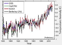
 If you're a climate hawk, or even a climate hobbyist, this graph should look familiar --- it's the warming trend over the last 100-odd years. Except the guy who busted this out at the House climate science hearing yesterday was brought in by the Republicans to debunk global warming. (The black line is his data.) Haha, whoops!
This graph is the result of physicist Richard Muller's project to get maximally accurate temperature data. Climate change deniers assumed that his skepticism about existing temperature data meant he was on their side (well, that and he's also been spreading misinformation about the "Climategate" emails). The Kochs were so convinced of this that they donated $150,000 to his lab --- which makes it all the more delightful that Muller is now all "thanks, suckers, here's the same data everyone else already had." (Okay, he put it like this: "We see a global warming trend that is very similar to that previously reported by the other groups. "¦ I believe that some of the most worrisome biases are less of a problem than I had previously thought." But you know what he meant.)
Muller was one of the only scientists the Republicans brought in --- among their five experts were an economist, a lawyer, and a professor of marketing. But hey, when there are so few scientists who are actually on your side, you have to go with what you've got. And evidently, even that doesn't always work.


 'Green News Report' 4/21/26
 Week 8: Iran War Lies Continue from Sundowning Gaslighter-in-Chief: 'BradCast' 4/20/26
 Sunday 'WWJD?' Toons
 U.S. Middle Eastern 'War Crimes' Then and Now: 'BradCast' 4/16/26
 Trump's USDA Takes Chainsaw to U.S. Forest Service: 'BradCast' 4/15/26
 Midterm Elections Reality Check:
 'Green News Report' 4/14/26
 Another Mad, Mad, Mad, Mad Weekend: 'BradCast' 4/13/26
 Sunday 'Mission Accomp...' Toons
 MAGA Buckles: 'BradCast' 4/9/26
 'Green News Report' 4/9/26
 Chaos, 'Ceasefire' Politics, Iran with Upper Hand: 'BradCast' 4/8/26
 Bye Bye Bondi (and It's TACO Tuesday Again!): 'BradCast' 4/7/26
 Trump Unhinging: 'BradCast' 4/6/26
 Potential Disaster for Democracy in Deep 'Blue' CA
 BRAD BLOG on the Move: Some good news for a happy change!...
 Trump Over a Barrel on Iran: 'BradCast' 3/25/26
 'Holding Out Hope' for SCOTUS on Late Mail Ballots: 'BradCast' 3/24/26
 FCC Chair Follows Instructions, Approves Unlawful Merger: 'BradCast' 3/23/26
 VA GOP VOTER REG FRAUDSTER OFF HOOK
 Criminal GOP Voter Registration Fraud Probe Expanding in VA
 DOJ PROBE SOUGHT AFTER VA ARREST
 Arrest in VA: GOP Voter Reg Scandal Widens
 ALL TOGETHER: ROVE, SPROUL, KOCHS, RNC
 LATimes: RNC's 'Fired' Sproul Working for Repubs in 'as Many as 30 States'
 'Fired' Sproul Group 'Cloned', Still Working for Republicans in At Least 10 States
 FINALLY: FOX ON GOP REG FRAUD SCANDAL
 COLORADO FOLLOWS FLORIDA WITH GOP CRIMINAL INVESTIGATION
 CRIMINAL PROBE LAUNCHED INTO GOP VOTER REGISTRATION FRAUD SCANDAL IN FL
 Brad Breaks PA Photo ID & GOP Registration Fraud Scandal News on Hartmann TV
  CAUGHT ON TAPE: COORDINATED NATIONWIDE GOP VOTER REG SCAM
 CRIMINAL ELECTION FRAUD COMPLAINT FILED AGAINST GOP 'FRAUD' FIRM
 RICK SCOTT GETS ROLLED IN GOP REGISTRATION FRAUD SCANDAL
 VIDEO: Brad Breaks GOP Reg Fraud Scandal on Hartmann TV
 RNC FIRES NATIONAL VOTER REGISTRATION FIRM FOR FRAUD
 EXCLUSIVE: Intvw w/ FL Official Who First Discovered GOP Reg Fraud
 GOP REGISTRATION FRAUD FOUND IN FL


